This is a brief outline of the sequences in the development of the science of map making. It lists some of the significant developments and people involved. It is essentially a European view and it needs to be emphasised that this development was not evenly spread across the Earth. Indeed, many of the pictorial techniques which were developed very early on are still being used today.
In the Beginning
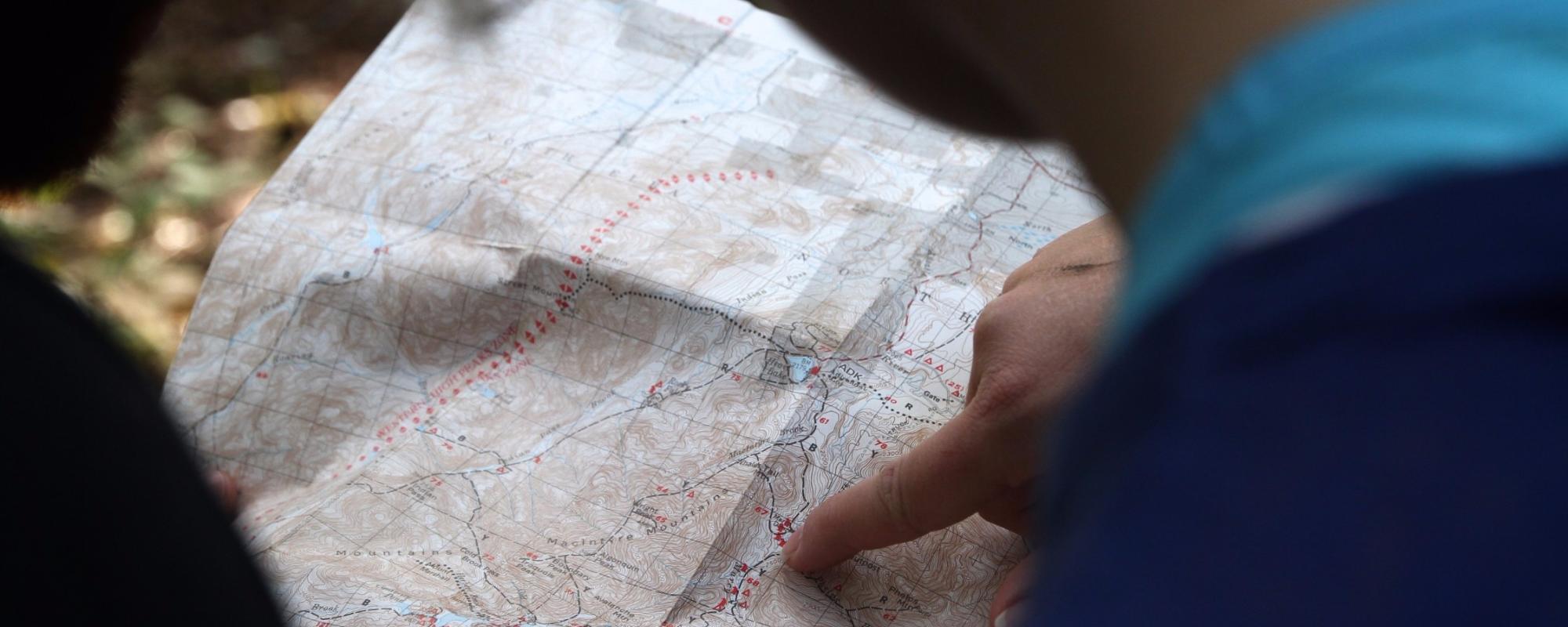
Humans have long recognised the importance and value of maps to their lives. Indeed, the history of mapping can be traced to more than 5,000 years ago. Maps are essentially tools which:
- for the map maker, record the location of places of interest.
- for others, are a source of learning about the geography of the mapped area.
Compared to modern maps, early maps:
- depicted small areas (a city, a trade route, a hunting ground, a military campaign etc.)
- were pictorial in nature. While they look crude compared to modern maps, they were able to show the features that the map maker wished to record.
- had no rules relating to how they were oriented – modern maps usually have north at the top.
- the relationship between features on the map and reality on the Earth was often not accurate. For example, features in the centre of the map would be shown in great detail, but features closer to the map’s edges were much more basic.
- in many cases were works of art first and reference documents second; part of the reason for this is that the maps were made by hand, were expensive to make and were somewhat of a status symbol to own
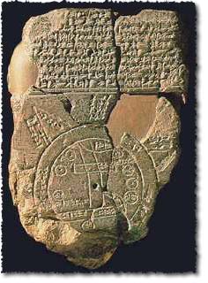
A few examples of mapping which occurred before 4 BC include:
- relatively simple sketches on clay tablets by the Babylonians (see example above)
- extensive work by the Egyptians to document and record property boundaries
- delicate maps on silk from China
Ptolemy
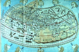
Note:
- the lines of latitude and longitude
- the stylised way that features are drawn
- the highly artistic ‘look-and-feel’ of the map
The Greeks and Romans continued to refine the art of map making, culminating with the work of Claudius Ptolemaeus (in English Ptolemy). Ptolemy was a geographer, mathematician and astronomer who lived in Roman Egypt. In about 150 AD he famously published a scientific treatise titled Geographia (in English Geography). This contained thousands of references and maps of various parts of the world – with longitude and latitude lines. This system revolutionised European geographic thinking, by imposing mathematical rules to the composition of maps.
Ptolemy’s work continued to be of great importance to European and Islamic scholars well into the Renaissance (1500s).
The Middle Ages
In Europe during this period, there was little progress in improving the science of mapping and geography. As most maps were produced within monasteries, religious zeal tended to dominate mapping. One interesting development was the adoption of the principle of having Jerusalem in the centre of a ‘world’ map and the Orient (Asia) at the top of the map. Also, in part as a religious statement but also for artistic reasons, maps drawn in this time were also heavily decorated. The decoration often included angels and imaginary monsters.
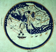
In the Islamic world, the study of the science of mapping and geography did progress. An excellent example of this is the work of Al-Idrisi, an Arab scholar in the court of King Roger II of Sicily. In the period around 1154 he produced a number of outstanding ‘world’ maps and geographic books. The first of these books had the delightful title of ‘The Amusement of him who desires to traverse the Earth’. It is believed that the influence of Al-Idrisi’s work was far reaching with generations of Islamic map makers using his designs as the basis of their maps.
See About Projections for information about modern conventions.
After the Middle Ages
In Europe, the Renaissance period brought a number of significant changes which hugely affected mapping:
- the invention of the printing press by Johannes Gutenberg in 1440 meant that monasteries (ie religious orders) no longer dominated map production
- the discovery of the Americas and expanded contact with the Orient resulted in greater interest in distant places and migration
- the growth of major publishing houses which produced maps that were accessible to all – not just the wealthy elite
- the growth in public learning brought a thirst for knowledge – this was aided by the establishment of institutions such as the French Academy of Science, which was established in 1666 to encourage scientific research – including the improvement of mapping and navigation charting
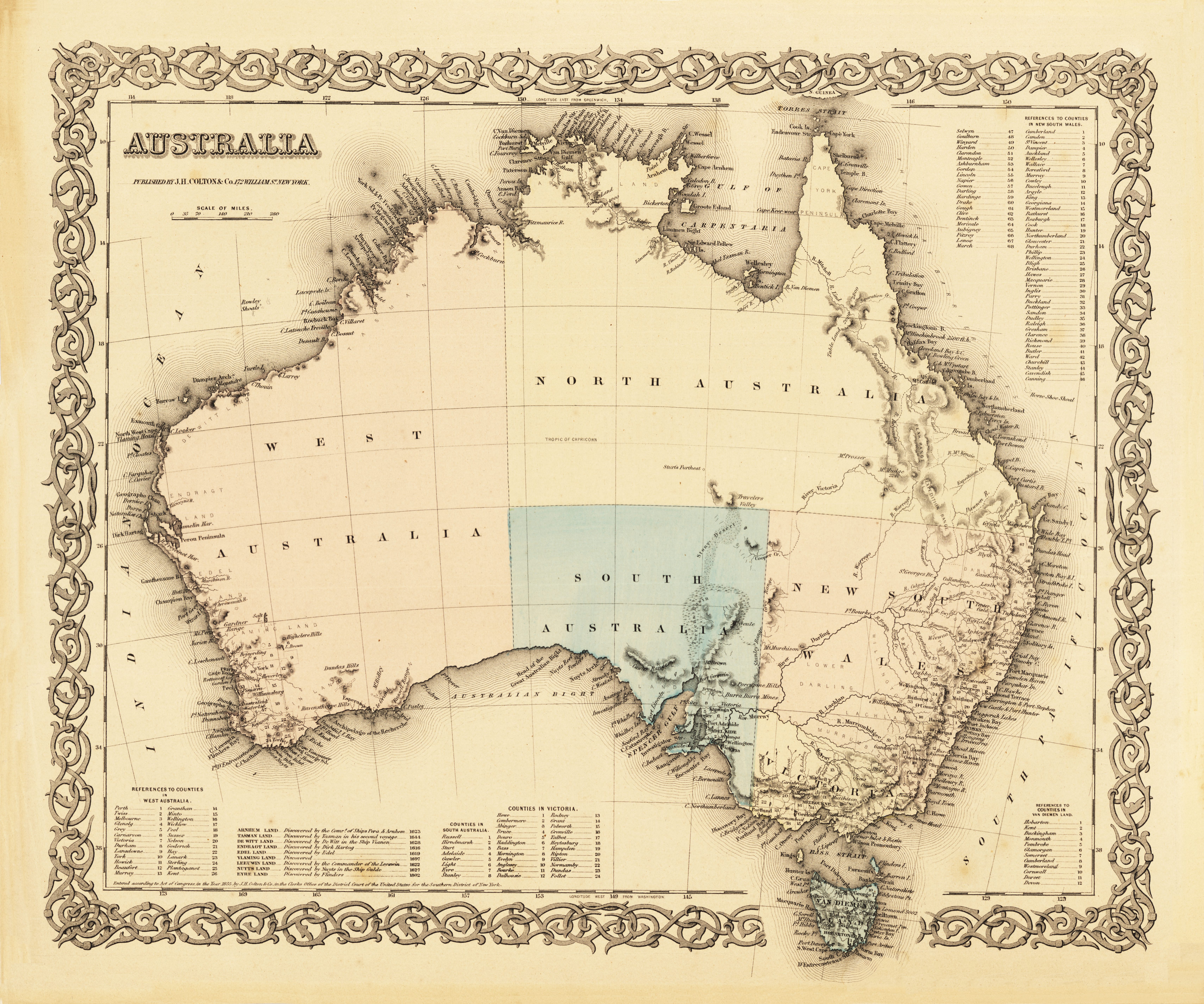
- Base map printed in a dark colour (usually black or sepia)
- The addition of colour by hand painting (it is interesting to note that, in haste, the artist painted the land as well as water areas around Adelaide. Also, an incorrect river (ie not the Murray River) has been shown as the Victoria/New South Wales border.
- The elaborate frame which is reminiscent of the earlier hand drawn maps where all the paper was filled by gargoyles, cherubs etc
- If you look closely the lines of longitude are indicated as west from Washington (on the bottom of the map) and east from Greenwich (on the top of the map).
All these led to a massive expansion in geographic knowledge and mapping. Earlier maps in this period tended to be simple ‘black-and-white’ maps which showed coastlines, country borders, mountains, rivers, place names etc. In many cases these were then ‘hand painted’ to add some colour to the finished product.
In the late-1700s maps which showed a theme started to emerge. These were used to record the spread of a particular ‘event’ – for instance, the location of people who had a contagious illness or the extent of a flood.
Through the ages maps have become more complex and more accurate – particularly as understanding of the Earth, mathematics and geography has expanded.
The Modern Era
Using modern satellite systems and surveying techniques, contemporary cartographers are now able to measure and map with very high precision and consistency. As a result, maps have become absolutely critical to most fields of human endeavour.
Further Reading
- World Maps Online, History of Maps http://www.1worldglobes.com/History/historyofmaps.htm
- Emporia State University, Brief History of Maps and Cartography http://academic.emporia.edu/aberjame/map/h_map/h_map.htm
- Euratlas, History Mapping Used for Non-Historical Purposes http://www.euratlas.com/Mapping/MappingHistory.htm
- Departmant of Primary Industries and Water, Brief History of map making in Tasmania http://www.tasmap.tas.gov.au/do/page/about
- University of Southern Maine, Osher Map Library, Smith Center for Cartographic Education http://www.oshermaps.org/
Links to Map History Websites
- Tony Campbell, former Map Librarian at the British Library, has run the 'Map History' gateway site since 1997 http://www.maphistory.info/
-
- The Truckers Report - The Guide to Maps and Mapping http://www.thetruckersreport.com/the-guide-to-maps-and-mapping/